Objective
My goal was to identify trends and behaviors related to content moderation, including how flagged, deleted, ignored, or reported content affects user engagement. I also aimed to provide actionable insights to improve the efficiency of content review processes and optimize engagement across the platform.
Skip to Code ShowcaseHigh-Level Findings
- Total Content: I analyzed over 50,000 posts across all students.
- Average Number of Posts Per Student: Each student averaged 540 posts.
- Average Percent of Flagged Content: 5% of all content was flagged by my system for review. This suggests that students tend to have a manageable portion of content requiring moderation. They also seem to have less of a history and may moderate their own content more effectively than the average user.
- Average Percent of Deleted Content (Flagged Content): Only 4% of flagged content was deleted, indicating that a small proportion of flagged content is deemed inappropriate. This highlights that the system’s flagging mechanism may be overly sensitive, resulting in false positives.
Bar Graph 1

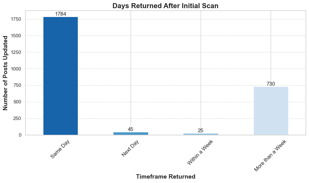
The chart above shows the timeframes in which students returned to update their flagged content after the initial scan. Most updates occurred on the same day the content was flagged, accounting for 1,784 posts. A smaller number of updates happened after more than a week (730 posts), with minimal activity observed the next day (45 posts) or within a week (25 posts).
Key Insight: The majority of user updates happen immediately on the same day, while a smaller secondary group returns after an extended period of over a week.
Bar Graph 2

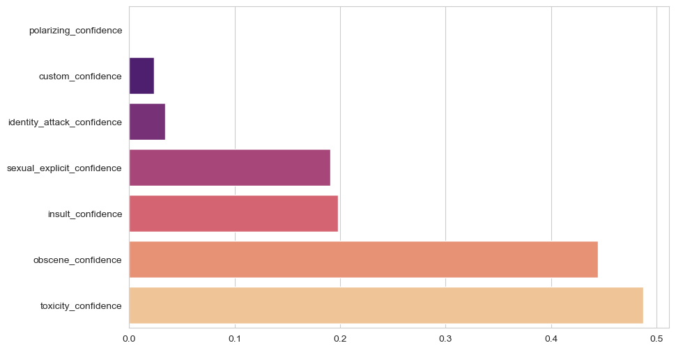
The chart above illustrates the confidence scores of various content moderation categories, including toxicity, obscenity, insults, and polarizing content. Observations indicate that confidence levels across most categories are relatively low:
- Toxicity Confidence: The highest average score at 0.45, indicating limited confidence in detecting toxic content.
- Obscene Content Confidence: Slightly lower, averaging 0.42.
- Insults and Sexual Explicit Content: These categories show moderate scores of 0.30 and 0.28, respectively.
- Polarizing and Identity Attacks: The lowest scores, averaging 0.10, suggest significant challenges in detecting these content types.
Key Insight: The low confidence scores across categories suggest that the content moderation model may struggle to classify inappropriate content accurately. This could explain why 10% of flagged content is ignored and only 4% is deleted. A more robust model with improved confidence levels could help reduce ignored flagged content and improve deletion rates.
Conclusion
I analyzed how students interact with flagged content and the actions they take, such as deleting, ignoring, or reporting it. The majority of flagged content is addressed on the same day, while a smaller portion of students return after a week or more to address flagged content.
My analysis revealed that 10% of flagged content is ignored, compared to only 4% being deleted. This suggests that much of the flagged content is not deemed inappropriate, or my flagging system might be overly sensitive (low confidence).
The analysis reveals that low confidence scores are a likely contributor to the system's inability to distinguish inappropriate content effectively. This could lead users to ignore flagged content rather than act on it. Improving the model’s confidence through enhanced datasets, better training processes, and targeted feature engineering will be critical to achieving better content moderation outcomes.
By focusing on categories with the lowest confidence, such as polarizing content and identity attacks, we can ensure that the system more accurately flags inappropriate material, resulting in higher deletion rates and fewer ignored flags.
Potential Next Steps
- Review Flagging Sensitivity: With 10% of flagged content being ignored and only 4% deleted, I plan to revisit the sensitivity of the flagging system to reduce false positives and ensure truly inappropriate content is flagged.
- User Education and Engagement: The low percentage of reported content (0.04%) suggests that students may not fully understand the reporting feature. I propose introducing new engagement strategies, such as a "Train our AI Day", to encourage students to interact with the system effectively while learning about the report feature. Additional incentives might help boost participation.
- Content Moderation Tools: I aim to implement more intuitive tools for students to moderate their content, such as a swipe interface similar to apps like Tinder, to make moderation faster and more engaging.
- Deep Dive into Ignored Content: I plan to investigate why a significant portion of flagged content is ignored by analyzing patterns or surveying users to understand their choices.
- Monitor Long-Term Engagement: Most users only return to update content once. I propose sending email reminders about pending flagged content to encourage further engagement.
Python Code Showcase
This project utilized Python extensively for exploratory data analysis, cleaning, statistical insights, and visualizations. Below are some key examples demonstrating my proficiency in working with data using Pandas, custom functions, and visualization tools like Matplotlib and Seaborn.
Exploratory Data Analysis
# Check data types
print(data.dtypes)

# Check the shape (number of rows and columns)
print(data.shape)

# Get summary statistics
print(data.describe(include='all'))

# Group by 'business_customer_id' to count the number of posts for each user
posts_per_student = data.groupby('business_customer_id')['id'].count()
Data Cleaning and Transformation
# Drop rows with any missing values
data_cleaned = data.dropna()

# Convert 'createdAt' and 'updatedAt' to datetime
data_cleaned['createdAt'] = pd.to_datetime(data_cleaned['createdAt'], errors='coerce')
data_cleaned['updatedAt'] = pd.to_datetime(data_cleaned['updatedAt'], errors='coerce')

# Calculate the difference in days between 'createdAt' and 'updatedAt'
data_cleaned['update_duration_days'] = (data_cleaned['updatedAt'] - data_cleaned['createdAt']).dt.days
Custom Function for Classification
# Define a function to classify the date difference
def classify_update_duration(days):
    if days == 0:
        return 'Same Day'
    elif days == 1:
        return 'Next Day'
    elif days <= 7:
        return 'Within a Week'
    else:
        return 'More than a Week'
Statistical Insights and Visualization
# Convert the counts to a DataFrame
classification_counts_df = classification_counts.reset_index()
classification_counts_df.columns = ['Update Duration', 'Count']

# Sort the values by the custom category order
classification_counts = classification_counts.sort_index()

# Set style
sns.set(style="whitegrid")

# Create a figure and axis object
fig, ax = plt.subplots(figsize=(10, 6))

# Plot the bar chart
classification_counts.plot(kind='bar', color=sns.color_palette("Blues_r", len(classification_counts)), ax=ax)

# Set title
plt.title('Days Returned After Initial Scan', fontsize=16, weight='bold')

# Set x and y labels
plt.xlabel('Timeframe Returned', fontsize=14, weight='bold')
plt.ylabel('Number of Posts Updated', fontsize=14, weight='bold')

# Rotate x-axis labels
plt.xticks(rotation=45, fontsize=12)

# Add gridlines
plt.grid(True, which='both', axis='y', linestyle='--', linewidth=0.7)

# Add data labels
for idx, value in enumerate(classification_counts):
    ax.text(idx, value + 1, str(value), ha='center', va='bottom', fontsize=12)

# Display plot
plt.tight_layout()
plt.show()
These examples highlight my ability to clean and transform data, derive statistical insights, and create professional-quality visualizations that communicate actionable findings effectively.