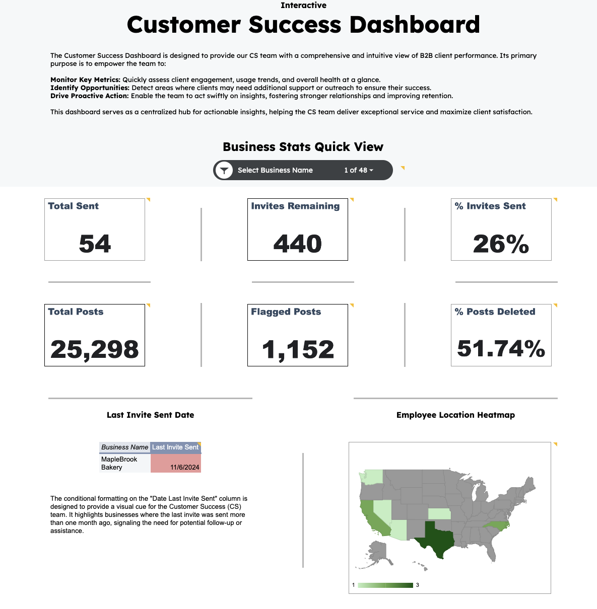
Excel Dashboard
This project showcases advanced Excel techniques, combining powerful formulas, dynamic calculations, and interactive visualizations to analyze and present key business insights. Key techniques and tools used in the project include:
- Data Cleaning: Leveraged Excel functions such as
TRIM,TEXT, andSUBSTITUTEto ensure data consistency and accuracy. - Formulas: Implemented advanced formulas like
XLOOKUPandINDEX-MATCHfor efficient data retrieval and dynamic referencing. - Date Calculations: Utilized functions like
DATEDIFto calculate durations for timeline analyses. - Charts and Visualizations: Created interactive charts (bar, line, and combo charts) to track trends and KPIs at a glance.
- Scorecards: Developed performance scorecards to highlight key metrics, enabling quick assessments of business health.
- Conditional Formatting: Applied rules to visually distinguish outliers, trends, and thresholds, enhancing data interpretability.
- Dashboards: Designed an intuitive, user-friendly layout with slicers and filters for real-time data exploration.
 Explore Interactive Dashboard
Key Insights
-
Business Stats Quick View: High-level KPIs include:
- Total Sent: 54 invitations sent to business clients.
- Invites Remaining: 440 invitations left to send.
- % Invites Sent: 26% of total invitations have been sent.
- Total Posts: 25,298 posts analyzed for insights.
- Flagged Posts: 1,152 posts flagged for potential review.
- % Posts Deleted: 51.74% of flagged posts were deleted.
- Last Invite Sent Date: Displays the most recent invitation date for each business. Conditional formatting highlights businesses overdue for outreach, enabling prioritized follow-ups.
- Employee Location Heatmap: A geographic visualization of employee distribution, allowing for better regional coverage and activity tracking.